

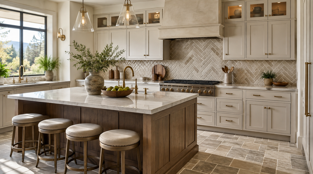
A kitchen tile can look completely different depending on how it is laid. The same rectangular tile might feel classic in a traditional running bond, crisp and contemporary in a stacked grid, or much more decorative in a herringbone arrangement. That makes layout one of the most important design decisions in a kitchen remodel.
For homeowners in Larkspur, kitchen design often needs to balance style with everyday practicality. Tile may appear on the floor, backsplash, behind the range, around an island, or across several of these surfaces. Choosing the right layout helps those elements work together instead of competing for attention.
At Carpet World of Colorado Springs, homeowners can explore tile options with guidance from a knowledgeable, non-commission sales team focused on matching products to each customer's space and preferences. The tile itself matters, but size, orientation, grout lines, cabinetry, countertops, lighting, and room proportions all influence the finished result.
Whether you want a relaxed kitchen with natural character or a cleaner contemporary look, these tile layouts can help you create a space that feels intentional and works beautifully for everyday life.
Start With the Kitchen Before Choosing the Pattern
It is tempting to fall in love with a tile layout first and work everything else around it. A better approach is to look at the entire kitchen before deciding how the tile will be installed.
The strongest layout usually responds to the room rather than competing with it.
Look at the Size and Shape of the Kitchen
Layout can influence how large, long, wide, or busy a room appears.
A simple grid can make a compact kitchen feel orderly. Long rectangular floor tiles installed in a consistent direction can visually lead the eye through an open space. A detailed herringbone pattern creates more movement and may work better as a focused feature than across every surface.
Consider where someone naturally looks when entering the kitchen.
If the backsplash is immediately visible, it may be the ideal place for a decorative pattern. If a large floor stretches through an open kitchen and dining area, a calmer layout may give the room better visual balance.
Consider the Existing Design Features
Cabinets, countertops, appliances, hardware, and architectural details already create lines throughout the kitchen.
Shaker cabinet doors bring one type of geometry. A dramatic stone countertop introduces another. Open shelving, a large range hood, and an oversized island can also become strong visual features.
The tile layout does not need to compete with all of them.
If the cabinetry and countertops already have plenty of visual movement, a straightforward tile pattern can create balance. If the rest of the kitchen is restrained, the layout can take on a more expressive role.
Decide Where You Want the Eye to Go
A tile pattern can quietly support a room or become its main design feature.
Ask what deserves attention.
It could be:
A range and custom hood
A kitchen island
A large backsplash wall
A window over the sink
An open transition into the dining area
A beautiful countertop
The tile itself
Once you know the focal point, it becomes much easier to select a layout that reinforces it.
Running Bond: A Familiar Layout That Works in Almost Any Kitchen
Running bond, sometimes called a brick pattern, remains one of the most recognizable tile layouts. Each row is offset from the row above it, creating a relaxed pattern that adds movement without making the room feel overly decorative.
It is especially familiar with rectangular subway-style tile, although many tile sizes can be installed using variations of the same idea.
Why Running Bond Works So Well
One of the biggest advantages of running bond is versatility.
It can work with farmhouse, transitional, traditional, and contemporary kitchens depending on the tile itself. A handmade-look ceramic tile creates a softer, more organic result, while a smooth rectangular porcelain tile can make the same basic layout feel much cleaner.
The pattern also provides enough visual movement to keep a backsplash interesting without demanding all the attention.
For a kitchen with statement countertops, detailed cabinetry, or bold lighting, that balance can be valuable.
Use It for a Relaxed Backsplash
Running bond works particularly well from the countertop to the upper cabinets.
A light neutral tile can keep the area fresh and open, while a darker or more saturated color can add character. Changing the grout contrast can also change the overall effect.
A grout color that sits close to the tile color tends to soften the grid. More contrast makes every individual tile more noticeable.
Consider the Offset Carefully
Not every rectangular tile needs to use exactly the same offset.
Tile dimensions and manufacturer recommendations can influence the most appropriate layout, particularly with longer-format products. Before committing to a specific pattern, review installation guidance for the selected tile.
A professional installer can also help plan the arrangement so cut pieces, corners, outlets, and transitions look intentional across the finished surface.
Stacked Tile: Keep the Kitchen Clean and Contemporary
A stacked layout places tiles directly above and beside one another instead of offsetting each row.
The result is an organized grid with clear horizontal and vertical lines.
It may sound simple, but that simplicity can give a kitchen a strong modern identity.
Horizontal Stacking Makes a Space Feel Calm
When rectangular tiles are stacked horizontally, the layout creates long lines across the wall.
This can work well in kitchens where homeowners want the backsplash to feel structured without becoming a major decorative feature.
The clean grid is particularly effective with tiles that already have visual interest through color variation, glazing, texture, or handmade edges.
Because the layout itself is restrained, the material gets more attention.
Vertical Stacking Adds Height
Turn the same rectangular tile vertically and the effect changes.
Vertical stacked tile draws the eye upward, making it an interesting choice for backsplashes that extend to the ceiling or surround a tall range hood.
It can also make a familiar subway-style tile feel more current without requiring a complicated pattern.
In kitchens with limited wall space, vertical orientation can introduce a subtle sense of height and help the backsplash feel like a deliberate design element.
Precise Alignment Matters
A stacked layout highlights straight lines, so careful installation becomes especially important.
Grout joints, edges, outlets, corners, and changes in wall alignment are easier to notice when the entire pattern follows a strict grid.
That is one reason professional planning and installation can make such a noticeable difference in the finished appearance.
Herringbone: Create a Kitchen Focal Point With Movement
Herringbone uses rectangular pieces arranged at angles to create a distinctive zigzag effect. It has been used in design for generations, yet it can feel surprisingly modern depending on the tile and color palette.
Daltile's current pattern resources continue to include herringbone among established tile-layout options, showing how adaptable the pattern remains across different tile collections and dimensions.
For Larkspur homeowners who want the tile to become part of the room's personality, herringbone is worth considering.
Make the Range Area the Feature
You do not have to install herringbone across the entire backsplash.
One effective approach is to use a simpler pattern throughout most of the kitchen and introduce herringbone behind the range.
This creates a defined focal point without filling every wall with movement.
A border or subtle change in tile tone can frame the feature, although the transition needs careful planning so the design feels integrated rather than added afterward.
Let Neutral Tile Carry the Pattern
A decorative layout does not require a dramatic color.
White, cream, warm gray, taupe, or other neutral tile can create plenty of visual interest when arranged in herringbone.
This is particularly useful when the kitchen already includes natural wood, stone countertops, or other materials with strong visual character.
The pattern supplies movement while the restrained color helps keep the overall room balanced.
Homeowners exploring different formats, finishes, and styles can compare Tile flooring options to see which products work naturally with more decorative layouts.
Remember That More Pattern Means More Visual Energy
Herringbone creates many diagonal lines.
That can look beautiful on a feature wall but may feel busy when combined with heavily patterned countertops, detailed cabinet doors, bold flooring, decorative lighting, and multiple colors.
Before using it across a large area, consider which other surfaces can stay quieter.
A strong kitchen design does not require every material to become a focal point.
Large-Format Tile: Give Floors a More Open, Streamlined Look
Large-format tile is often chosen for floors because fewer individual pieces can create a more continuous appearance.
The reduced number of grout lines can help a kitchen feel visually calmer, particularly when the flooring continues into an adjoining dining or living space.
Use Larger Tile to Simplify a Busy Kitchen
Kitchens naturally contain many visual elements.
Cabinet doors, drawers, appliances, countertops, stools, hardware, lighting, and everyday objects all break up the room.
A larger floor tile can provide a quieter foundation underneath those details.
Neutral porcelain with subtle stone-inspired variation is one option for homeowners who want texture without introducing a highly decorative floor pattern.
Straight Layouts Keep the Focus on the Material
Large-format tiles often work beautifully in straightforward layouts.
When the tile already includes veining, tonal shifts, or a stone look, adding an elaborate pattern may not be necessary.
Instead, the emphasis can stay on the scale and finish of the material.
This can work particularly well in open kitchens where the floor needs to coordinate with several adjoining areas.
Plan Cuts Before Installation Begins
Large tiles make planning especially important.
The installer needs to consider room dimensions, cabinet lines, islands, doorways, transitions, and where cut pieces will appear.
Starting a layout without considering the full room can leave narrow cuts in highly visible locations.
A planned installation allows tile placement to respond to the kitchen's architecture and creates a much more intentional finished appearance.
Checkerboard and Grid Layouts Can Add Character Without Overcomplicating the Room
Not every memorable layout needs angled cuts or elaborate shapes.
A simple square grid can become a strong design feature when two colors are alternated in a checkerboard pattern.
Daltile also lists checkerboard and grid-based arrangements among its established one-tile pattern options.
Choose Softer Colors for a More Relaxed Look
Traditional black-and-white checkerboard creates strong contrast, but it is not the only option.
Homeowners can soften the idea with combinations such as:
Cream and warm beige
Soft gray and white
Taupe and ivory
Muted charcoal and warm neutral
Two shades from the same color family
Lower contrast can preserve the charm of the checkerboard pattern while making it easier to coordinate with cabinetry and countertops.
Consider Scale
Small checkerboard tiles produce more pattern and visual activity.
Larger squares create a broader, calmer look.
Kitchen size, cabinet style, and the amount of visible floor all influence which scale feels appropriate.
A sample board can be helpful, but seeing several tiles laid out together provides a much better understanding of how the finished pattern will read across the room.
Keep Other Elements in Balance
A checkerboard floor already makes a statement.
Pairing it with a simpler backsplash can help the room feel intentional rather than crowded.
The reverse is also true. If a decorative backsplash is the main feature, a straightforward floor arrangement usually gives the kitchen more breathing room.
Mosaic and Geometric Tile: Use Pattern Where It Has the Most Impact
Mosaics, hexagons, pickets, penny rounds, and other geometric formats give homeowners more opportunities to create a personalized kitchen.
Current tile design resources continue to show geometric mosaics and alternative orientations as ways to introduce character through shape and pattern.
The key is deciding where that extra detail adds value.
Use Mosaics in Smaller Feature Areas
A small area can handle a lot of personality.
Consider geometric tile:
Behind a range
Inside a beverage station
Around open shelving
On a compact backsplash wall
Inside a decorative niche
Using the pattern in a defined area also allows it to stand out rather than becoming visual background.
Think About Grout as Part of the Design
Small-format tile naturally creates more grout joints.
That means grout color has a stronger influence on the final appearance.
Matching grout can make multiple pieces blend into a more unified surface. Contrasting grout emphasizes every shape and makes the pattern much more obvious.
There is no universally correct answer. It depends on whether you want the geometry to whisper or become a feature.
Balance Detail With Maintenance Preferences
More grout lines also mean more grout surface to maintain.
That does not make mosaics impractical, but it is worth considering how much cleaning you want to manage in a busy kitchen.
Backsplashes typically face a different type of wear from kitchen floors, so the same mosaic that works beautifully on a wall may not be the preferred choice underfoot.
Match the Layout to the Style of Your Larkspur Kitchen
There is no single tile layout that works best for every Larkspur home.
The area's setting offers plenty of inspiration for interiors that feel warm, natural, comfortable, and connected to their surroundings. The Town of Larkspur describes the community as nestled in the foothills between Castle Rock and the Tri-Lakes area, with small-town character and natural scenery.
Your kitchen can respond to that setting without becoming themed or overly rustic.
For a Warm, Natural Kitchen
Consider:
Stone-look porcelain
Handmade-look ceramic backsplash tile
Running bond layouts
Warm neutral grout
Earth-inspired colors
Matte or softly textured finishes
These choices can complement wood cabinetry, natural finishes, and relaxed interiors.
For a Contemporary Kitchen
Consider:
Large-format floor tile
Vertical stacked backsplash tile
Straight grids
Low-contrast grout
Clean neutral colors
Simple geometric shapes
Keeping the layout controlled allows modern cabinetry and architectural lines to remain prominent.
For a Transitional Kitchen
A transitional kitchen can combine familiar materials with a fresher layout.
A classic rectangular backsplash tile installed vertically or in herringbone is one example. Another is a restrained stone-look floor paired with a slightly more decorative backsplash.
This approach works well for homeowners who want an updated space without committing to a highly specific trend.
Plan the Entire Tile Layout Before Installation Starts
Choosing the pattern is exciting, but planning determines whether it looks polished once it reaches cabinets, outlets, corners, doors, and other fixed elements.
Dry Layouts Can Reveal Problems Early
Before permanent installation, seeing how tiles repeat across a surface can help identify awkward cuts or positioning.
This is especially important with:
Herringbone
Checkerboard
Large-format tile
Geometric patterns
Patterned tile
Backsplashes with multiple outlets
A small adjustment to the starting point can significantly change what appears at the edges of a wall or floor.
Think About Focal Points and Sight Lines
Stand in the places where the kitchen will most often be viewed.
Look from the entryway, dining room, living area, sink, and island.
A centered backsplash feature may matter more from one sight line than another. On floors, grout lines may look better aligned with architectural features rather than simply beginning at the nearest wall.
Good layout planning considers how the room is experienced, not merely how its measurements look on paper.
Professional Installation Helps Protect the Design
Decorative layouts depend on consistent spacing, cuts, alignment, substrate preparation, and careful finishing.
Even a simple stacked grid can look noticeably different when lines drift across a wall.
Experienced flooring installers can evaluate the chosen tile, surface, room dimensions, and layout requirements before installation progresses. This allows the design idea and the technical installation plan to work together from the beginning.
Choose a Layout That Still Feels Right After the Remodel Is Finished
The best kitchen tile layout is not necessarily the most elaborate one.
It is the layout that supports the architecture, complements the cabinets and countertops, fits the amount of visual activity in the room, and feels appropriate for the way you want your kitchen to look every day.
Running bond offers familiar versatility. Stacked tile creates cleaner lines. Herringbone brings movement and makes an excellent focal point. Large-format tile can simplify expansive floors, while checkerboards and mosaics introduce character when the surrounding materials are carefully balanced.
For Larkspur homeowners, the opportunity is to build a kitchen that feels personal without sacrificing practicality. Tile color and material matter, but layout is what gives those choices rhythm and direction across the finished room.
Carpet World of Colorado Springs combines more than 40 years of flooring and design expertise with personalized service, professional installation, and a non-commission sales approach. Their team can help homeowners compare tile styles and think through how size, shape, pattern, grout, and surrounding finishes will work together.
Planning a kitchen update in Larkspur? Get in touch with Carpet World of Colorado Springs to discuss your tile options, design ideas, and installation needs.


